 CI/BI
CI/BI
SeAH Corporate Identity
-
Letter Mark

SeAHŌĆÖs letter mark expresses ŌĆśbalanced beautyŌĆÖ, a combination of both strength and flexibility. The top graphic element ŌĆśRising CurveŌĆÖ, symbolizes a frontier spirit of change and challenge.
-
Color System

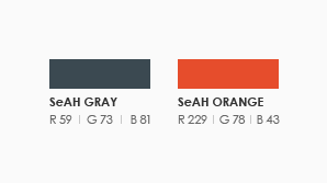
SeAH Gray personifies the companyŌĆÖs trust and embracing nature and SeAH Orange personifies flexibility and warmth.